Year
2025
Client
Skie Labs
Category
Landing Website
Product Duration
2 days
The Spark
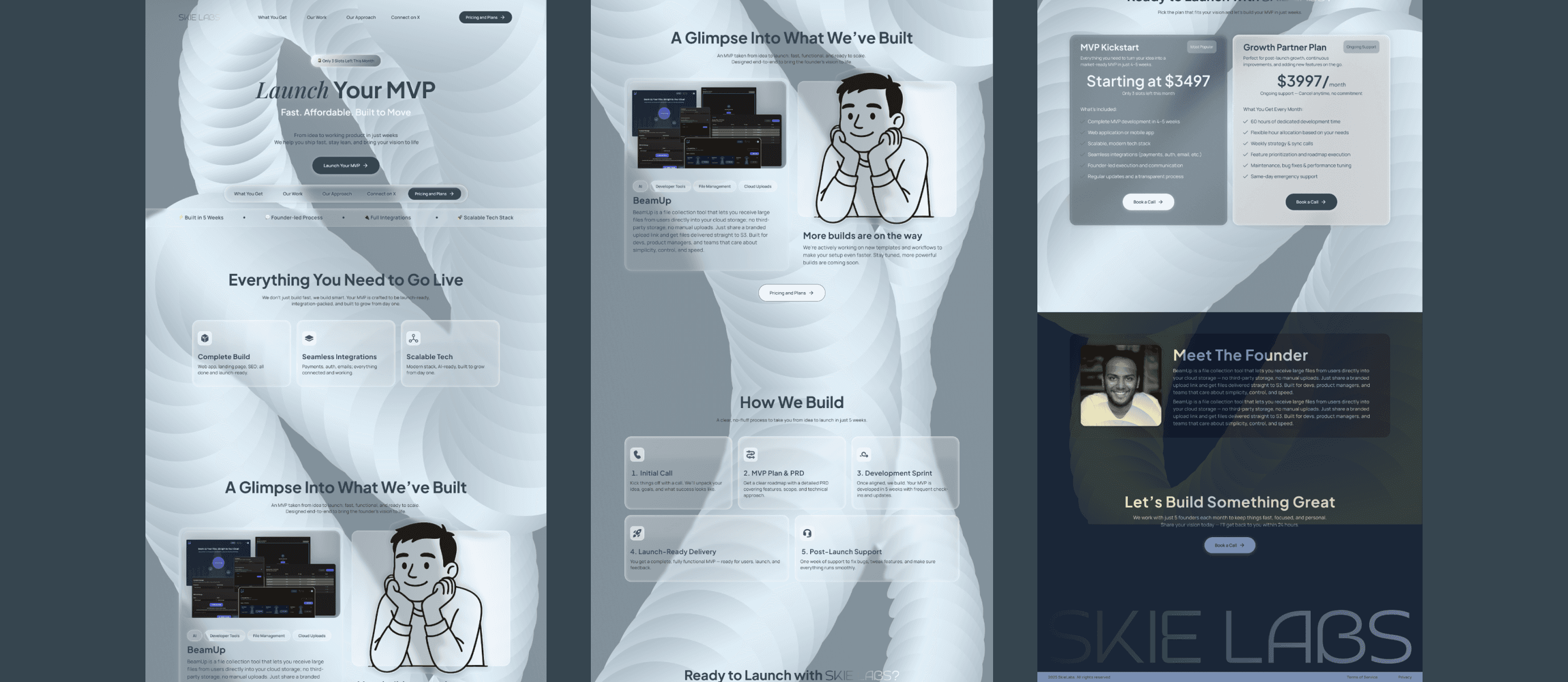
Skie Labs was looking to establish a bold digital presence that spoke directly to startup founders. They needed a website that made their value prop clear: fast MVPs without the fluff.
The Problem
How do you build trust with founders and still keep things lean and minimal? The site had to communicate capability and speed without coming off as generic or rushed.
The Client

Before diving into design, I studied other startup studio websites like Kr8 Agency, Ignyte Labs, and RVMP. The goal was to identify what worked well in terms of clarity, tone, and layout and then strip away the excess to create something sharper.
The final direction was clean, minimal, and direct.
A hero-first CTA to grab attention immediately.
Clear breakdown of what the user gets, followed by our approach.
Subtle hover effects on cards and icons to bring in just enough motion.
A single-case study (BeamUp) to demonstrate credibility without overwhelming the viewer and adding a "More builds are on the way" to show work is in progress
Every section was intentional, leading the visitor toward the final CTA: book a call and start building.

Key Challenges
The hardest part? Finding the sweet spot between minimalism and impact. I didn’t want to over-design, but the brand still needed to look like it could design and build high-quality products.
What I shipped
Full landing page UI designed in Figma
Content strategy and copywriting
Clean, responsive layout
Micro-interactions and hover states visualized for development handoff
Next Steps
If Skie Labs expands its offerings, the next steps could include building a case study library, a blog to share founder journeys, or an onboarding dashboard for new clients.
This project was scoped as a one-pager, but there's potential to grow the brand ecosystem further as their client base scales.
I learned the value of having a solid content structure first. Instead of obsessing over visual polish early, focusing on hierarchy and clarity up front helped the design feel grounded and made the bold/minimal balance easier to execute.